
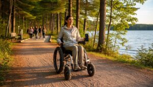
Clear, accessible signage transforms parks from challenging spaces into welcoming destinations for visitors of all abilities. As Ontario Parks continues its commitment to making nature accessible for everyone, proper handicap signage serves as the vital first step in creating truly inclusive outdoor spaces. Modern accessibility signs must meet specific height requirements (1.2 to 1.5 meters from the ground), feature high-contrast colors with proper tactile elements, and include both visual and tactile components to serve diverse needs. Beyond mere compliance, thoughtfully placed wayfinding markers and universal design symbols help create a seamless experience that empowers visitors with mobility challenges to navigate parks independently and with dignity. This fundamental infrastructure ensures everyone can confidently access and enjoy Ontario’s natural wonders, from parking areas to trail heads and essential facilities.
Current Accessible Signage Standards in Ontario Parks
AODA Requirements for Park Signs
Ontario parks must follow specific AODA guidelines to ensure their signs are accessible to everyone. All park signs should have high contrast colors, typically black text on white backgrounds or white text on dark backgrounds, making them easy to read from a distance. Text must be clear and large enough, with a minimum height of 70mm for main directional signs.
Signs should be positioned at a height between 1200mm and 1500mm from the ground, making them visible to both standing visitors and wheelchair users. Braille must be included on all permanent signs, positioned in the lower portion for easy access. The surface of signs needs to be non-glare and weather-resistant to maintain visibility in all conditions.
For trail markers and interpretive signs, parks must include tactile elements and use simple, clear symbols. Information should be presented in both text and pictogram format where possible. Signs must be placed along accessible routes and at key decision points, such as trail intersections or facility entrances, to help visitors navigate confidently.
Remember to keep signs well-maintained and free from obstruction – this isn’t just good practice, it’s part of the requirements!
Universal Design Principles in Action
When it comes to accessible signage in our parks, the benefits extend far beyond serving visitors with disabilities. Clear, well-designed signs with high contrast colors and tactile elements help everyone navigate more effectively, especially in challenging weather conditions or low light. Parents pushing strollers appreciate the same clear pathways that wheelchair users rely on, while seniors find the large, easy-to-read fonts just as helpful as visitors with visual impairments.
Consider a foggy morning on the trail – those raised letters and Braille markers become useful touch guides for all hikers. The consistent mounting height and placement of signs creates predictability, making it easier for first-time visitors and regular park-goers alike to spot important information quickly.
The thoughtful placement of signs at key decision points, combined with simple directional arrows and universal symbols, helps international visitors overcome language barriers. This inclusive approach to signage design creates a more welcoming environment where everyone can focus on what matters most – enjoying Ontario’s natural beauty with confidence and independence.
Key Features of Accessible Park Signs
Visual Accessibility Elements
When it comes to accessible signage, visual elements play a crucial role in ensuring everyone can easily read and understand the information. The key to effective accessible signs starts with strong contrast – typically dark text on a light background or vice versa. You’ll notice most accessible signs in Ontario parks use white text on a dark blue or black background, making them easy to spot and read from a distance.
Font size is another essential feature, with letters typically measuring between 16mm to 50mm in height, depending on viewing distance. The signs use sans-serif fonts like Arial or Helvetica, which are much clearer than decorative typefaces. Look for raised letters and numbers that stand out at least 0.8mm from the background – this tactile element helps both visually impaired and sighted visitors.
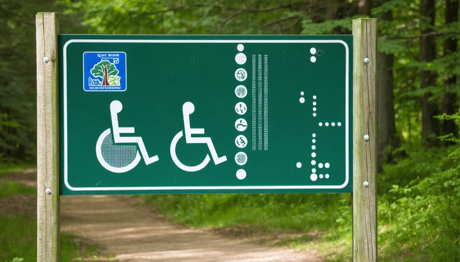
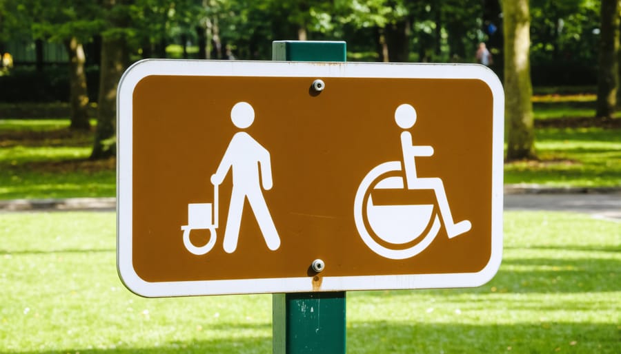
Universal symbols are also vital components of accessible signage. The International Symbol of Access (the familiar wheelchair icon) should be clearly visible and properly proportioned. Other commonly used symbols include directional arrows, restroom icons, and parking indicators, all designed with clear, bold lines.
The placement of signs matters just as much as their design. They’re typically mounted at eye level (about 1.5 meters from the ground) in well-lit areas, free from glare and shadows. You’ll find them positioned consistently throughout park facilities, making navigation more intuitive for everyone.
Smart tip: When visiting parks at dusk, look for signs with reflective materials that remain visible in low-light conditions – these are especially helpful during early morning or evening activities.
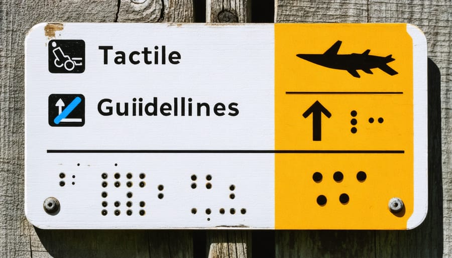
Tactile and Braille Components
Every trail marker and information sign in Ontario’s parks includes carefully designed tactile elements that make them readable through touch. Raised letters and numbers, with their distinct sans-serif fonts, stand at least 0.8mm high from the background surface, making them easy to detect with fingertips. These tactile elements aren’t just helpful – they’re essential for visitors with visual impairments to navigate independently.
Braille components complement these raised characters, following standardized Grade 2 Braille patterns that use contractions and shorter forms to convey information efficiently. What’s particularly impressive is how these smart technology solutions integrate seamlessly with traditional tactile elements, creating multi-sensory experiences for all visitors.
The placement of these tactile signs follows careful guidelines too. They’re typically mounted at a height between 1.2 and 1.5 meters from the ground, allowing both standing and wheelchair users to reach them comfortably. You’ll find these signs consistently positioned on the latch side of doors and at key decision points along trails.
What makes Ontario’s approach special is the attention to durability. The tactile elements are created using materials that resist weather damage and maintain their clarity even after years of exposure to the elements. This ensures that every visitor, regardless of their visual ability, can count on reliable navigation aids throughout their park experience.
Where to Find Accessible Signs in Ontario Parks

Trail Entrances and Markers
Trail entrances serve as critical decision points where clear, accessible signage becomes essential for all visitors. At these locations, you’ll find comprehensive information panels featuring high-contrast text and tactile elements that can be easily read by people with various visual abilities. The markers typically include raised lettering and Braille translations of trail names, distances, and difficulty ratings.
Look for the universal accessibility symbol at trailheads, which indicates whether the path ahead is wheelchair-friendly. These markers also display important details about trail surface type, average width, maximum slope percentage, and the location of rest areas – all vital information for visitors with mobility considerations.
Along the trails, you’ll notice marker posts at regular intervals, typically every 100 meters. These posts feature large, easy-to-read numbers and high-contrast colors that stand out against natural backgrounds. For added safety, many trails now include QR codes on their markers that link directly to digital trail maps and emergency services.
Pro tip: Before heading out, snap a photo of the trailhead sign with your phone. This gives you a handy reference for the trail’s accessibility features and helps you track your location using the marker numbers. Many visitors also appreciate the tactile trail maps available at main entrances, which provide a three-dimensional representation of the path ahead and help everyone better understand the terrain they’ll encounter.
Facility and Service Locations
Clear and well-placed signage for key facilities and services is essential for ensuring everyone can navigate parks and public spaces comfortably. You’ll find accessibility symbols directing visitors to wheelchair-accessible washrooms, designated parking areas, and barrier-free building entrances. Look for the International Symbol of Access (ISA) – the familiar white wheelchair icon on a blue background – which marks these amenities.
Common service locations that require accessible signage include visitor centers, picnic areas, camping facilities, and viewing platforms. In Ontario’s parks and recreational spaces, these signs are strategically positioned at eye level and feature high-contrast colors and raised lettering with Braille for visitors with visual impairments.
Pro tip: Most accessible washrooms and facilities are located near main parking areas and visitor centers for convenient access. You’ll also find directional signs with estimated distances and difficulty ratings for accessible trails and viewpoints.
Emergency services locations, such as first aid stations and emergency phones, are marked with both visual and tactile signs that can be easily identified day or night. Information kiosks typically include large-print maps highlighting accessible routes and amenities throughout the facility.
Remember that signs for accessible services should be visible from both standing and seated positions, ensuring everyone can spot them easily. Many locations now include QR codes on signs that link to detailed accessibility information and virtual guides.
Planning Your Visit with Accessible Signage in Mind
Before heading out to explore Ontario’s parks, take a few moments to plan your accessible park visit with signage in mind. Start by checking the park’s website for their accessibility map, which highlights the locations of accessible features and corresponding signage. Download or take photos of these maps on your phone for offline reference.
Arrive early in the day when possible, giving yourself plenty of time to familiarize yourself with the signage system. Upon arrival, stop at the visitor center first – staff can provide updated accessibility information and point out any temporary changes to regular routes or facilities.
Consider bringing a small flashlight, even during daytime visits. This can help make signage more visible in shaded areas or on overcast days. If you’re visiting with a group, designate someone to scout ahead for directional signs at trail intersections or facility locations.
Keep your phone charged for taking photos of informational signs you might want to reference later. Many visitors find it helpful to make note of landmark signs along their route, making it easier to navigate back to their starting point.
Ontario Parks continues to enhance its commitment to accessibility through clear, intuitive signage that welcomes everyone to experience the beauty of our natural spaces. From wheelchair-accessible trails to barrier-free facilities, these signs serve as beacons of inclusion, ensuring that nature’s wonders are available for all to enjoy. We invite you to visit our parks and experience firsthand how accessible signage makes navigation easier and more comfortable. Whether you’re planning a day trip or an extended stay, you’ll find our parks ready to accommodate your needs. Together, we’re building a more inclusive outdoor recreation experience that celebrates both nature’s diversity and human accessibility. Come explore Ontario Parks – where everyone belongs, and every trail tells a story of welcome.


+ There are no comments
Add yours